Menta Picante, a creative studio from Mexico, crafted a rustic brand identity for Tierra Sol, a company specializing in plants and handmade pots located in North Carolina.
Natural Simplicity
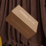
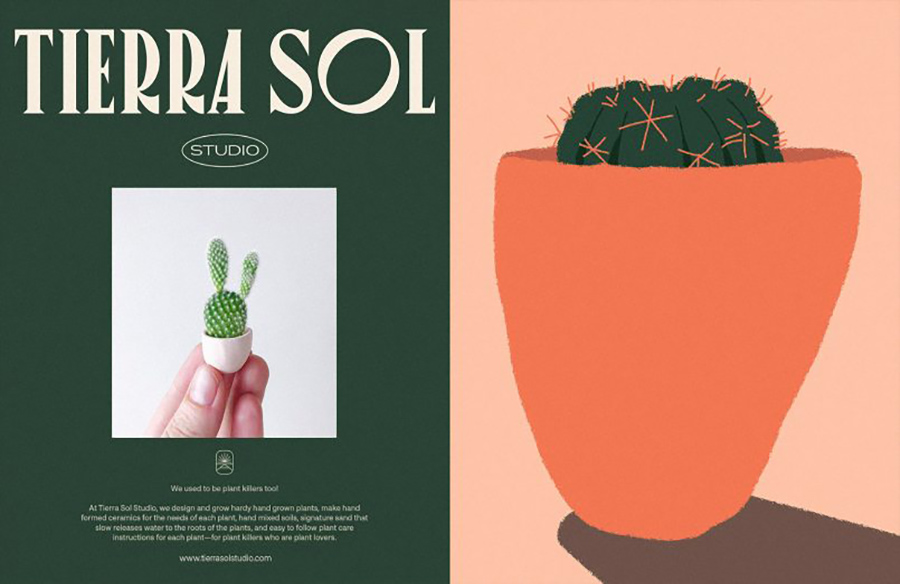
The design team at Menta Picante developed a straightforward identity system with a focus on nature. Drawing inspiration from the name itself, they embraced the simplicity of natural elements such as clay, cactus, soil, water, and sky colors. These elements formed the foundation of the color palette, infusing the brand with an earthy and organic feel.
Iconic Representation
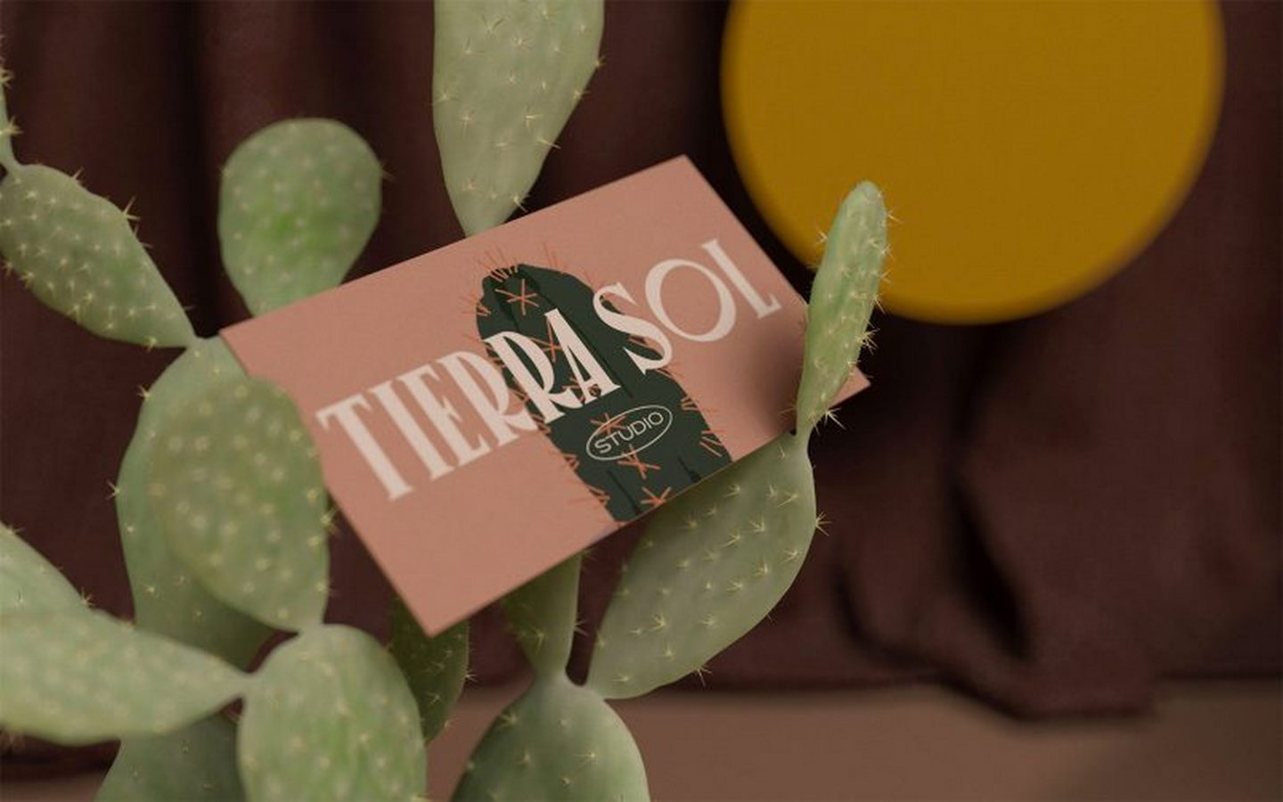
At the core of the brand identity is an icon that abstractly depicts a desert landscape, symbolizing the essence of Tierra Sol. Combined with the logotype, this icon achieves a harmonious balance between simplicity and timelessness. The use of clean lines and minimalist design principles ensures that the brand remains both elegant and approachable.
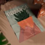
Carefree Illustrations
To complement the overall concept, Menta Picante incorporated playful illustrations with a carefree aesthetic. These illustrations add a touch of whimsy to the brand identity, evoking a sense of joy and spontaneity. By infusing the design with elements reminiscent of nature, the illustrations further reinforce Tierra Sol’s connection to the natural world.

Conclusion
In conclusion, Menta Picante’s branding for Tierra Sol seamlessly captures the essence of the company’s ethos: a celebration of nature and craftsmanship. Through a thoughtful blend of earthy tones, iconic symbolism, and whimsical illustrations, the brand identity reflects Tierra Sol’s commitment to quality and authenticity. As a result, Tierra Sol emerges as more than just a company—it becomes a symbol of harmony between humanity and the natural world.